Wednesday, 29 September 2010

Student Photography Competition 2010

For this task we had to take some promotional images for the college of various members of students and staff. Within my group we had to use the location lighting equipment to set up an area in the college and ask random members of staff and students if they would be willing to have their photo taken for the project. This gave us the opportunity to practise using and setting up the location lighting and approaching strangers and convincing them to work with us politely. We were working in a big group so with limited time it was difficult to get many shots done, and as I dedicated most my time to asking people to model for the group, I only had time to shoot with 2 different models. 
Without much time to brainstorm ideas before the shoot, I found it very difficult to direct my models and where they should be positioned and how to pose. Due to my surroundings that we used I chose to try a simplistic look to my images and this meant I didn't need to consider too much the poses used and the props used.
If I were to do this again I would experiment more with multiple models and move the positioning of the chairs and tables in the image. I would also interact with the models more to try to get a more natural smile as these seem rather forced.

I asked the model to stand for a few shots rather than sit in the chair as I didn't like how her jacket blended in with the chair, but I think this looks rather messy with the chair behind her, if I did this again I would either move the chair out the shot or move more props into the background to make the chair seem less randomly placed.

I like this image but I don't think the front facing pose is very flattering on the model and makes the image seem more like a passport style photo.

While taking this I wanted to get some space at the side to get the edge of the wall and make the surroundings look less like a studio shot, but I think this had made the image look messy so I will have to crop this out. 
I tried to incorporate the bags with the models to make the image seem more natural and give more of a clue of the personality of the model. I like this shot as there's a good balance between the bag and the model and the bag doesn't take too much attention away from the model.
I really like this image as the smile seems quite natural compared to the other images and I love the composition of the image.


I tried this idea but I really don't like this image. I struggled to focus the camera because it mostly focused on the chair rather than the girl, so I didn't concentrate much on the composition while I was busy sorting this. I may try cropping this to improve the composition and see if I can make the image stronger.

I like this image because most the images were full sized images with the model looking at the camera so I thought I'd try something a bit different and with the student lanyard drawing a bit of attention in the image it still sits well with the brief. Although I'm a bit disappointed about how the hand is cut off on the side.

Wednesday, 22 September 2010

One Shot.


For this part of our assignment we had to create an 8 in-8 in square image that includes one random object and people. I tried to make my object relevant to me, and I wanted to have a choice for my final image, so within my 5 photo limit I chose 3 different ideas. My first idea was to have my object be the cigarette being held by a girl sitting on the floor, the first 2 shot were ones I tried from different angles, but I prefer my final crop because it is simple and clear.


I liked this image, but thought it had too much emphasis on the hand and didn't really include much else.
I liked this image but was put off by the person standing in the background because it takes attention away from the main subject.
This is the image I used for my final image.

My other ideas were the 2 shown below using a book and a lollipop for my objects. I didn't like the composition of the image for the book, I would've preferred to have it more zoomed out and show more on the left of the image. I liked the image of the lollipop for the tight crop and the use of colour but I decided not to use it for my final image because I seemed a bit odd and I preferred my image with the cigarette. The lollipop image was a self portrait so I had to get someone else to take the photo and I directed them on how I wanted the shot to look.

Evaluation

Final Images

Research

Friday, 17 September 2010

Edited images

These are 2 possible final images that I decided to edit in Photoshop.

This is my original image taken at 1/125 shutter speed and an apparture of F.5.6.
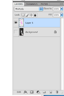
I started by rotating the image 180 degrees, altering the levels to make the image brighter and increasing the contrast. I then cropped the image to try to get rid of as much of the arm as possible, and then entered the quick mask mode. In this mode I used the brush to select the water in the image, and then with this selection I made a new layer where I coloured in the selected area in pink using the brush. I then put the layer in 'Multiply' mode so that the water could be seen behind the colour. I then realized that the cup didn't stand out very much in the image, so I selected the cup using the magnetic lasso tool and the inversed the selection, then selected 'Black and White' to make the background black and white. 
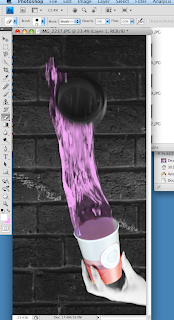


I then decided I should experiment with the colour of the water so I opened the Hue/Saturation while my colour layer was selected and started altering the Hue. I quite liked the light blue colour but I decided to stick with the more pink colour because it's more eye-catching and more unusual.
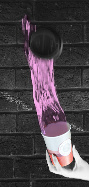
Final Edited Image


This is my original photo that I think looked rather dull so I wanted to slightly edit it to make the image seem more sunny. I started by altering the levels and making the image brighter, and then I increased the contrast.
That then created the image above, which is brighter but it seems a bit washed out and the colours seem a bit off, so I decided to alter the Hue as shown below. I think it made the image seem warmer and have more depth.
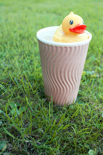

Final edited image

Location Images

Here are some of the photos that I took on location that I had time to try in my tight deadline.

The pictures of the rubber duck were taken on a grassy area near the college, I wasn't too concerned about the background because I knew I wanted the grass to be most the background, if not all of it. I want the top right picture to be used as a final image because I like the way it's composed and the way you can see the water dip where the duck is. 

The pictures of the water being poured out I want to edit on Photoshop to rotate it so the water is falling to the top and experiment with the colours used. I may also need to crop it to get rid of as much of the arm as possible so it's not too obvious it's been rotated. I will also make sure my image of the cup is sharp as I don't want motion blur on the cup. I took these photos on a 1/125 shutter speed and F.5.6 apparture, I wanted to use a quicker shutter speed to get rid of the motion blur but this made the image too dark and using flash reduced how many photos could be taken continuously.

I love my pictures of the tea in the cafeteria as I think it's simple, recognizable and I like the colours, although I doubt I will use one of these images as a final image as it's not too creative and I think a lot of people would have a similar idea, although I decided to shoot it anyway incase any of my other images didn't turn out the way that I'd wanted.