Showing posts with label p1. Show all posts

Friday, 17 September 2010

Research - Jonathan Knowles


Jonathan Knowles is a very successful commercial photographer who has done lots of advertising work for alcohol drinks companies. This means he has had to work a lot with cups, bottles and liquids and had to experiment with different ways of presenting them. His images range from the very simplistic to the highly detailed with his use of splashing and pouring liquids, and the way he positions his props.
I am very fond of Knowles' work as he creatively presents similar objects in many different ways to apply to lots of different advertising campaigns. The brand is always clear on the image and his use of the studio to create his images makes the images seem very neat and organised. Given the difficult circumstance of a rather bland product at first glance he excels in creatively varying all of his images.

Thursday, 16 September 2010

Research - William Lack


While searching through some commercial photographers I came across these images by William Lack which has really made me consider how liquid can be used in images and how strong it can be within the image. It has given me another idea that I would love to try in the studio if possible: to fill a cup with liquid, put the lid on and tip it upside down so that the liquid pours out, if I take a photo of this while the liquid is pouring out and then rotate it so it looks like the liquid is falling to the ceiling it can create a more abstract look to the project.
 William Lack was born in 1971 and studied Business Studies at Manchester University. He has been a photographer for 15 years and uses a digital studio for most of his images although he started off as a global freelance photographer. He now specialises in commercial and corporate images to be used within businesses. Personally, I find his commercial images rather bland but for corporate work they fit well with the theme as everything has to stay looking professional so minilist works well with this. I also think the style of his images portray his background in business and his interest with it.

I am much more keen on his portrait photography which portrays the personalities of the models within the images, but again seem rather like the simple generic photos which most studios produce to be brutally honest.

Research - Costa Coffee

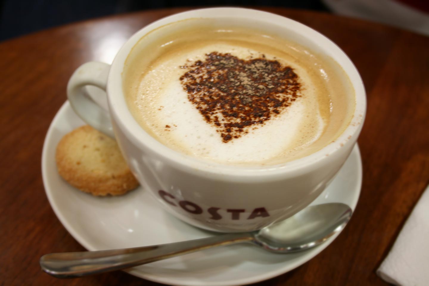
Costa Coffee is a large cafe business which often uses images of cups to promote itself, having the brand name usually on show printed on the cup or just showing the coffee in the cup to clearly portray what they do. They have many different styles of images in their promotion which are used as part of the artwork in the cafes and for advertising purposes. 

The Costa image has become so well known that these images can be shown at most places with quick recognition to the brand. The use of the cups have contributed strongly to this and have become the recognizable feature to the company. Their use of the simple logo being shown in many different ways, makes it easy to remember and recognize. The use of it in the artwork inside the cafe aswell (such as with the image above with the heart in the cup) just emphasizes on the logo and brand of the company. Also the fact they have images with celebrities and the cups has helped to promote them out to that celebrity's audience.
Personally, I love the image of the heart in the coffee cup shown above. It's simple, cute and all the colours compliment each other. Aswell as this it's such a normal image but the fact the heart is there it's a bit of a change on what is normally seen so draws the eye in and adds interest to the whole image.

Research on Huhtamaki

Huhtakmaki is a packaging company that creates it's disposable cups to be used by many different food services across the world. This means that they're designs have to be fairly simple to accommodate for any company that wants to use their products. Also the fact that their clients come from many different countries means that all advertising images can't use text as then there will be issues with translation. I also need to consider that they have other products available on the website so I need my images of cups to fit in with the other images on the website.

"Huhtakmaki is a global packaging company that provide's the world's most recognizable consumer packaging and foodservice containers, as well as the retail lines of Chinet premium disposable tableware, Bibo and Lily."
This is a quote from the company's website so this is how the company chose to present themselves. Their website is rather simple yet professional so I imagine the image I create with be preferred if it fits with this theme, therefore I think studio images would fit best with this theme. However, the website seems pretty new so that may explain the simplicity, so trying new images and being more creative may be more appreciated and create a new look for the company. Therefore I would like to create a wide range of photos to submit with lots of different styles to give the company lots of chose on what style they want to achieve.